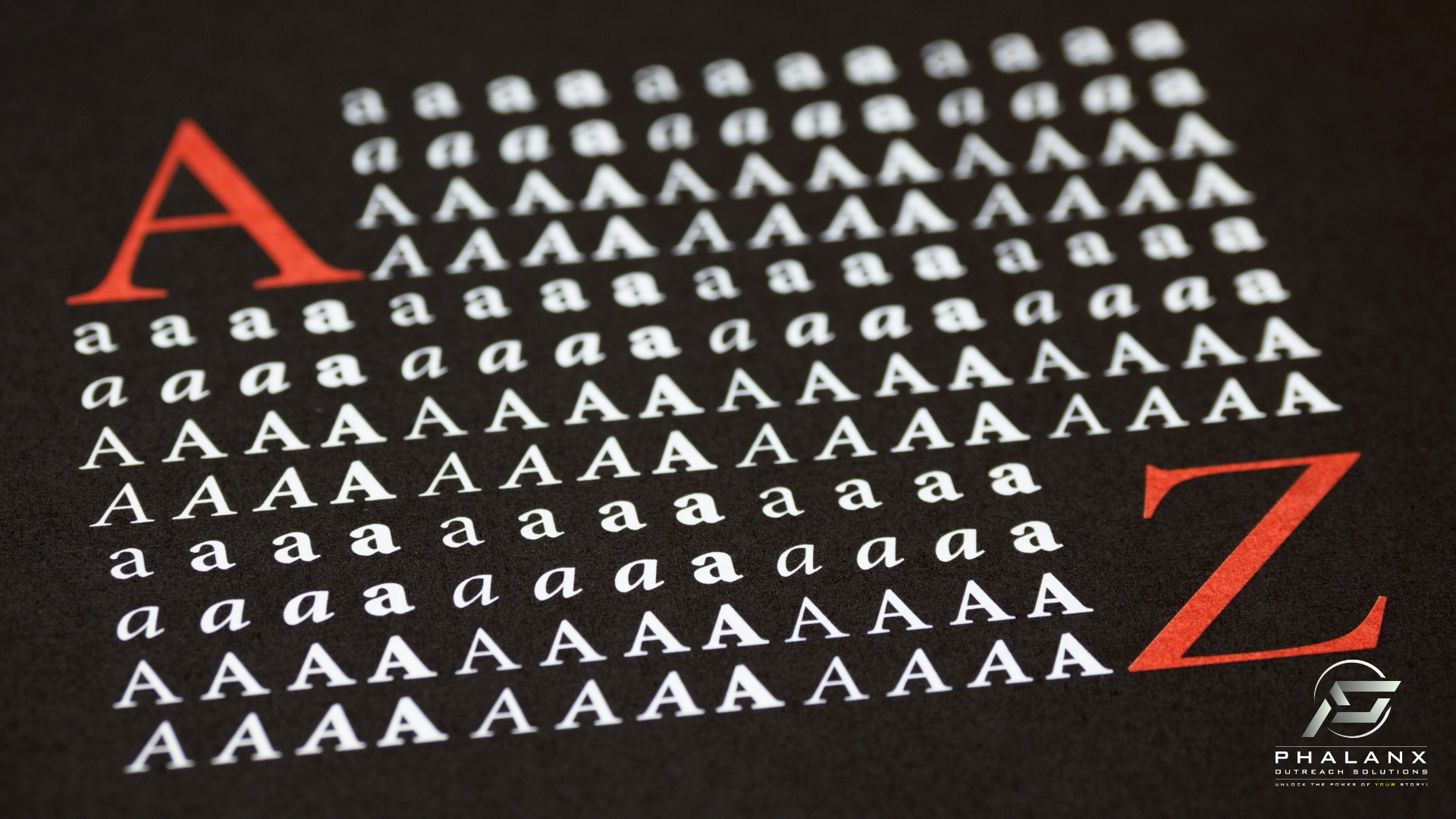
Hello, fellow design enthusiasts and font fanatics! Today, we’re diving into a topic that’s close to my heart—fonts! Yes, those delightful designs that make our texts sing and our designs pop. But have you ever thought about how fonts are not just styles of text but carry their own unique meanings and vibes? Let’s explore this fascinating aspect.
The Power of Helvetica
Ah, Helvetica! This font is like the comfortable jeans of the typography world—versatile, reliable, and extraordinarily approachable. Created in 1957 by Swiss typeface designer Max Miedinger, Helvetica was designed with neutrality in mind, making it perfect for any message to stand out through its content, not its form.
What draws me to Helvetica is not just its clean lines and uncluttered appearance; it’s how it commands presence without overwhelming the eyes. It’s the design equivalent of a Swiss Army knife—functional, straightforward, and always in style. Whether it’s for corporate logos, government communications, or tech startups, Helvetica has been the backdrop for many iconic brands, demonstrating its versatility and timeless appeal.
The Personality of Fonts
Every font tells a story. Just like people, fonts have personalities! Each one brings a different flavor and emotion to the table, influencing how a message is perceived. Let’s check out the vibes of some popular fonts:
- Times New Roman: Picture the quintessential university professor — wise, authoritative, and steeped in tradition. Times New Roman is the font you call on when you need to make a scholarly statement or when only the most serious attire will do for your document.
- Open Sans: Imagine a friendly, reliable neighbor who’s always there with a cup of sugar or timely advice. Open Sans is modern, clean, and incredibly approachable, making it perfect for everything from a quick email to an important business presentation.
- Garamond: Envision an elegant intellectual at an upscale gala, wine glass in hand, discussing fine arts and history. Garamond carries an air of sophistication and old-world charm that enhances the depth of historical texts or any content that aims for a refined touch.
- Arial: Think of a no-nonsense office manager — practical, efficient, and ready to handle daily tasks with clarity. Arial is the go-to for straightforward communication, ensuring that nothing gets lost in translation in the corporate world.
- Roboto: Meet the tech whiz of the font family. Roboto feels at home in any digital interface, blending modern sensibilities with friendly openness. It’s ideal for apps and websites where you need to combine tech-savvy with user-friendly charm.
- Calibri: Picture a youthful startup team—energetic, friendly, and full of new ideas. Calibri is casual yet professional, perfect for internal communications or any project that needs to feel accessible but not overly informal.
- Courier New: Step back into a 1950s newsroom with typewriters clacking away. Courier New carries a nostalgic vibe, perfect for scripts, screenplays, or any project that needs a touch of the vintage aesthetic.
- Verdana: Imagine a helpful librarian, always ready to assist and ensure you find exactly what you need. Designed for high legibility on digital platforms, Verdana is the font you want for web content that must be readable at various sizes and on different devices.
- Futura: Consider the visionary architect, sketching bold and futuristic structures that break the mold. Futura’s geometric lines and clean appearance make it the choice for brands looking to project a forward-thinking and stylish image.
- Baskerville: Visualize a distinguished author from the 18th century, crafting literary masterpieces. Baskerville speaks with a tone of quiet elegance and understated authority, perfect for publications that require a classic, timeless feel.
Ensuring Accessibility with ADA-Compliant Fonts
Making your digital content accessible isn’t just good practice—it’s essential. According to the Americans with Disabilities Act (ADA), it’s important to consider everyone, including those with visual impairments. So, choosing the right fonts is key. Think about using easy-to-read options like Arial, Verdana, Roboto, Open Sans, or Calibri because of their clean and straightforward styles.
But it’s not all about the font—you’ve got to think about other stuff too, like contrast and layout. High contrast between your text and its background makes your content pop and easier to read. And keep things simple—busy backgrounds can distract and confuse. You also want to make sure there’s enough space between your words, lines, and letters, so everything’s super clear.
Remember, every detail matters in design. By choosing the right fonts, colors, and spacing, you’re not just ticking compliance boxes; you’re also making sure your content can be enjoyed by as many people as possible. It shows you care about your audience and want to make sure everyone feels included. So next time you’re whipping up something for the web, keep these tips in mind to create something that’s welcoming for everyone!
The Art of Choosing the Right Font
Selecting the perfect font is akin to choosing the right outfit for an important interview—it introduces and speaks for you even before you say a word. It’s an art where style meets function, and the medium is as impactful as the message itself. So next time you’re picking a font, consider what it reveals not just about your message, but also about your personal or brand style.
What’s your favorite font, and what do you think it says about your style?


